I know the typeface for the LUCID brand logo is a custom designed sans serif font. Does anyone know what font is used on the interfaces? Custom or an existing font? It resembles Gotham. Whatever they use it's a terrific choice. Easy to read in either uppercase or lowercase, or mixed. There's a lot of information to communicate in the different sections of the interfaces so font choice, color, size and density of information is critical. I was a little worried that the sections on either end of the cockpit screen would be difficult to read. Not the case at all.
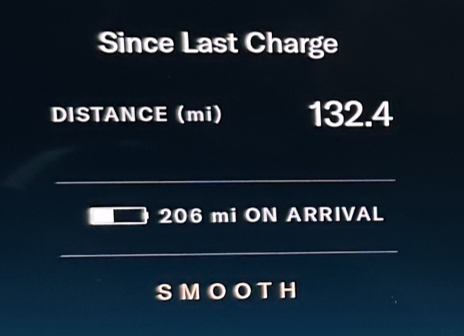
Take this example (it's fuzzy due to using a cell phone camera, please ignore lack of crispness). There is a larger heading, upper and lower case in bold time boxes the information below in (Since Last Charge). The data descriptor is in all caps and body size with the unit designation in parentheses. The numbers are larger and bolder than the letters. (DISTANCE (mi), 132.4)
A light rule transitions your eye to the next block of content. The important information is displayed using visual and numerical display but in this case the unit of measure is not in parentheses, as it has already been communicated in the line above. Uppercase and a slightly larger size tells us the vehicle battery state, but clearly states ON ARRIVAL so we don't contuse it with battery state in the moment..
Another thin rule transitions us to the current drive mode which could impact the battery data point we just read if we make any changes. The drive mode is in all caps in a different color and slightly kerned. Elegant.

