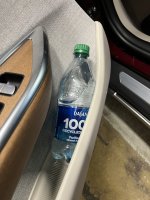
How have others delt with the tight cup holder? It won't fit most water bottles. With large paper coffee cups we have had to be very careful placing them in and out so the tops don't come off. This aluminum cans of soda the can starts to crush as it becomes more empty. Interestingly Lucid included a water bottle, when we picked up our car, which is much skinner than any water bottle we own. Has anybody purchase a cup adapter?
You are using an out of date browser. It may not display this or other websites correctly.
You should upgrade or use an alternative browser.
You should upgrade or use an alternative browser.
Cup Holder To Tight
- Thread starter changenow
- Start date
BuddhaDada13
Active Member
- Joined
- Mar 7, 2022
- Messages
- 124
- Cars
- Lucid AGT Black/Mojave
I bought this one. It works but takes up so much room that the other holder next to it cannot be used for drinks.

ThanksI bought this one. It works but takes up so much room that the other holder next to it cannot be used for drinks.
I have some Zojirushi coffee mugs that fit like a charm. The only problem with them is that they’re so efficient at retaining heat that coffee that you put into it actually gets hotter with time.  This is clearly a violation of laws of thermodynamics, but science is just a theory, okay?
Also, the standard mouth hydro flasks fit but it’s tight. All my Contigo mugs are a no go.
This is clearly a violation of laws of thermodynamics, but science is just a theory, okay?Also, the standard mouth hydro flasks fit but it’s tight. All my Contigo mugs are a no go.
Last edited:
I'm also checking to see how others are addressing large cups.How have others delt with the tight cup holder? It won't fit most water bottles. With large paper coffee cups we have had to be very careful placing them in and out so the tops don't come off. This aluminum cans of soda the can starts to crush as it becomes more empty. Interestingly Lucid included a water bottle, when we picked up our car, which is much skinner than any water bottle we own. Has anybody purchase a cup adapter?
As for water bottles, I find the best place to put them is in the door pockets of each of the 4 doors which allows easier access to the bottom of the pilot panel.. There is already a detent in there to keep the bottle from sliding in.
Attachments
- Joined
- Dec 26, 2022
- Messages
- 41
- Cars
- Grand Touring
Vendors have been designing cup holders for decades. Any one of those designs would have been fine. Instead, Lucid had to re-engineer a new type of cup holder, and get the dimensions wrong.
I think this design mistake is emblematic of the poor design decisions that have plagued us so much, especially on the UI. It's hard to believe that in 2024 we still have that weird jumping-out-of-view behavior of the HomeLink buttons, the weird placement of clocks (sometimes resulting in two clocks right next to each other!), the waste of the right hand side of the main display, laggy button response, laggy door locks, etc., etc.
My "favorite" (i.e., don't like it) is that the map lights near the rear view mirror have a slow response. For some reason, some designer thought it would be cool to have the lights dim slowly instead of shutting off. The result is that you click it, it doesn't respond, and so you click it again, which makes it turn back on. The damn things are frustrating. Someone actually designed that feature. But apparently they never watched anyone try to use it. Do they really think that it is important to train the entire population on a new behavior for light buttons?
And, lest we forget, they designed that crazy thumbwheel+button on the steering wheel, the one that breaks and is very hard to use. Or the fact that the rear window shades go up if you happen to try to close an already-closed window.
I'd like to meet the design team some day. They worked pretty hard, I'm sure. But someone needs to be the one who says, "Really? Is it important we design a new way to turn off lights?"
This is kind of silly, use the map lights once and you know how it works.Vendors have been designing cup holders for decades. Any one of those designs would have been fine. Instead, Lucid had to re-engineer a new type of cup holder, and get the dimensions wrong.
I think this design mistake is emblematic of the poor design decisions that have plagued us so much, especially on the UI. It's hard to believe that in 2024 we still have that weird jumping-out-of-view behavior of the HomeLink buttons, the weird placement of clocks (sometimes resulting in two clocks right next to each other!), the waste of the right hand side of the main display, laggy button response, laggy door locks, etc., etc.
My "favorite" (i.e., don't like it) is that the map lights near the rear view mirror have a slow response. For some reason, some designer thought it would be cool to have the lights dim slowly instead of shutting off. The result is that you click it, it doesn't respond, and so you click it again, which makes it turn back on. The damn things are frustrating. Someone actually designed that feature. But apparently they never watched anyone try to use it. Do they really think that it is important to train the entire population on a new behavior for light buttons?
And, lest we forget, they designed that crazy thumbwheel+button on the steering wheel, the one that breaks and is very hard to use. Or the fact that the rear window shades go up if you happen to try to close an already-closed window.
I'd like to meet the design team some day. They worked pretty hard, I'm sure. But someone needs to be the one who says, "Really? Is it important we design a new way to turn off lights?"
Window shades work exactly like they do in the S class Mercedes. Not sure where the drama is here.
Other items/design quirks agreed.
- Joined
- Aug 23, 2020
- Messages
- 2,969
- Location
- Paradise Valley, AZ
- Cars
- Lucid GT
- Referral Code
- K9WIJHB0
When you look at design decisions in isolation or out of context of other design considerations and tradeoffs as you have doen, it is easy to take potshots at it. Unless you were part of the design team, you will not understand all of the other considerations/constraints that factored into that decision. I agree the cup holders are too small but I doubt that the design is a result of Lucid wanting to redesign cup holders. I suspect it is the result of how much space was available after other design elements were finalized. You can argue that there may have been better tradeoff options but to imply incompetence or design mistakes is a bit much.Vendors have been designing cup holders for decades. Any one of those designs would have been fine. Instead, Lucid had to re-engineer a new type of cup holder, and get the dimensions wrong.
I think this design mistake is emblematic of the poor design decisions that have plagued us so much, especially on the UI. It's hard to believe that in 2024 we still have that weird jumping-out-of-view behavior of the HomeLink buttons, the weird placement of clocks (sometimes resulting in two clocks right next to each other!), the waste of the right hand side of the main display, laggy button response, laggy door locks, etc., etc.
My "favorite" (i.e., don't like it) is that the map lights near the rear view mirror have a slow response. For some reason, some designer thought it would be cool to have the lights dim slowly instead of shutting off. The result is that you click it, it doesn't respond, and so you click it again, which makes it turn back on. The damn things are frustrating. Someone actually designed that feature. But apparently they never watched anyone try to use it. Do they really think that it is important to train the entire population on a new behavior for light buttons?
And, lest we forget, they designed that crazy thumbwheel+button on the steering wheel, the one that breaks and is very hard to use. Or the fact that the rear window shades go up if you happen to try to close an already-closed window.
I'd like to meet the design team some day. They worked pretty hard, I'm sure. But someone needs to be the one who says, "Really? Is it important we design a new way to turn off lights?"
- Joined
- Nov 19, 2021
- Messages
- 6,829
- Location
- Cupertino, CA
- Cars
- Air DE-P, ZR, 21"
- DE Number
- 241
- Referral Code
- Q1BTN5Y3
That’s not what happened. They did not “re-engineer” a cup holder.Vendors have been designing cup holders for decades. Any one of those designs would have been fine. Instead, Lucid had to re-engineer a new type of cup holder, and get the dimensions wrong.
That wheel was supposed to have the same clickiness as the center volume wheel. That obviously didn’t work out. But it isn’t “poorly designed”; I actually quite like the design. It just didn’t get implemented as well as it needed to.And, lest we forget, they designed that crazy thumbwheel+button on the steering wheel, the one that breaks and is very hard to use.
New steering wheels don’t have issues with breaking buttons. Took iteration.
I’ve met them. They did work extremely hard, and continue to.I'd like to meet the design team some day. They worked pretty hard, I'm sure.
But back to cup holders and water bottle holders, because they are a perfect example: you and I are not perfectly aware of all of the design considerations that went into it. Yes, the car was built from a napkin; but not *every* component was designed and built by Lucid.
Imagine, for a moment, that the seats were off the shelf from some other manufacturer, and then upholstered / modified to fit the dimensions of the Lucid Air. If that were the case, perhaps they’d be limited on space for what to do with the center console? And if so, then do you make the car wider? Or do you make the cup holders smaller, since you already have water bottle holders in the doors?
For what it’s worth, the center console cup holders were never intended to hold water bottles. They hold cups great, and some water bottles fit fine. Water bottles are what the door sides were designed for. (I confirmed this with some members of the design team previously)
In the whole context of things, not a big deal I thinkVendors have been designing cup holders for decades. Any one of those designs would have been fine. Instead, Lucid had to re-engineer a new type of cup holder, and get the dimensions wrong.
I think this design mistake is emblematic of the poor design decisions that have plagued us so much, especially on the UI. It's hard to believe that in 2024 we still have that weird jumping-out-of-view behavior of the HomeLink buttons, the weird placement of clocks (sometimes resulting in two clocks right next to each other!), the waste of the right hand side of the main display, laggy button response, laggy door locks, etc., etc.
My "favorite" (i.e., don't like it) is that the map lights near the rear view mirror have a slow response. For some reason, some designer thought it would be cool to have the lights dim slowly instead of shutting off. The result is that you click it, it doesn't respond, and so you click it again, which makes it turn back on. The damn things are frustrating. Someone actually designed that feature. But apparently they never watched anyone try to use it. Do they really think that it is important to train the entire population on a new behavior for light buttons?
And, lest we forget, they designed that crazy thumbwheel+button on the steering wheel, the one that breaks and is very hard to use. Or the fact that the rear window shades go up if you happen to try to close an already-closed window.
I'd like to meet the design team some day. They worked pretty hard, I'm sure. But someone needs to be the one who says, "Really? Is it important we design a new way to turn off lights?"
Like @borski said, the cup holder designed for cup. These Starbucks 12oz and 16oz style cups will fit perfectly into the Lucid cup holder. Ask me how I know.
Disclosure: I'm not a Starbucks fan. I just happen to have one of their 12oz and 16oz cups.
Disclosure: I'm not a Starbucks fan. I just happen to have one of their 12oz and 16oz cups.
 We're seriously talking about the size of cup holders? When I got the car delivered, I laughed about how tiny they were. Now, I own 2 slim water bottles that fit perfect in the cup holders and my travel backpack, along with the rule nobody can bring or order drinks (with tight lids) that can't fit in the cup holders. Problem solved.
Only problem I have with the cup holders is their location. When you have two bottles in them, you can't access the bottom half of the pilot panel or Start Massage button easily while driving!
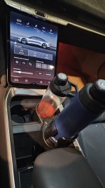
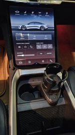
I got this one. https://www.amazon.com/Car-Cup-Hold...1-2-spons&sp_csd=d2lkZ2V0TmFtZT1zcF9hdGY&th=1
It actually works really well, but after using it for eight months, it doesn't lock into place as well as it first did. I'll probably replace it soon.
It actually works really well, but after using it for eight months, it doesn't lock into place as well as it first did. I'll probably replace it soon.
My water bottle is always in the map pocket. Because it fits there perfectly.
I would never use the cupholders, anyway. Especially not for a bottle. That's just going to make accessing the Pilot Panel harder.
I would never use the cupholders, anyway. Especially not for a bottle. That's just going to make accessing the Pilot Panel harder.
that looks like a good choice. If you have time and the motivation, would love to see a pic of what it looks like in the dash. does it block the other factory cupholder when it's in use?I got this one. https://www.amazon.com/Car-Cup-Holder-Multifunctional-Adjustable/dp/B0BNBW964C/ref=sr_1_2_sspa?crid=5J80BOLDXOI5&keywords=cup+holder&qid=1705015172&s=automotive&sprefix=cup+holder,automotive,174&sr=1-2-spons&sp_csd=d2lkZ2V0TmFtZT1zcF9hdGY&th=1
It actually works really well, but after using it for eight months, it doesn't lock into place as well as it first did. I'll probably replace it soon.
It takes up one of them but creates two in its place. My water bottle fits in the standard cup holder, but everyone else in the family has huge ones that don't.that looks like a good choice. If you have time and the motivation, would love to see a pic of what it looks like in the dash. does it block the other factory cupholder when it's in use?
Attachments
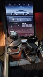
thanks for doing that so quick! ordered one. appreciate the tip!It takes up one of them but creates two in its place. My water bottle fits in the standard cup holder, but everyone else in the family has huge ones that don't.
Similar threads
- Replies
- 9
- Views
- 11K