New IOS Mobile App 2.0

What makes me tink there isn’t at least one member of the Lucid software team that is thinking, ‘Why bother releasing any new software, all we’ll get is bitching, moaning and complaints’’ ;)
That’s any customer facing software team always. You should have seen the Reddit forums when the profile button was moved.

“Who moved the cheese” is a more common phrase than it should be.

Sometimes it’s for the best, sometimes it’s for a promotion and job justification..

 
I'm not going to lie, the swipe to back is chef kiss (finally).

The bear ... I've never been fond of the logo over the company name.

The tab bar is driving me bonkers visually and the fact it's bound to the home screen is just replacing my original annoyance with the inability to swipe back (trade breaking the HIG for one thing for another).
Honestly for me, they could have kept all the account stuff as a button on the top right nav bar, and then eliminated the tab bar altogether. The maps tab is fairly useless to me. But my understanding is they plan to add more trip planning features to that in the future. And I’m sure some actually use it. Though Plug Share is always going to be more powerful. But maybe they’ll surprise me.
 
What makes me tink there isn’t at least one member of the Lucid software team that is thinking, ‘Why bother releasing any new software, all we’ll get is bitching, moaning and complaints’’ ;)
They’ll be used to it and probably learnt to tune out. Can’t please everyone.
 
  • Like
Reactions: Lvr
Honestly for me, they could have kept all the account stuff as a button on the top right nav bar, and then eliminated the tab bar altogether. The maps tab is fairly useless to me. But my understanding is they plan to add more trip planning features to that in the future. And I’m sure some actually use it. Though Plug Share is always going to be more powerful. But maybe they’ll surprise me.
So you're now thinking like I am.

The tab bar's usefulness confuses me. Account shouldn't be a tab and now we're toggling between a Map and a massive landing page. This is where I start to pick apart how the Home Screen is a dumping ground and the design language is inconsistent. Tabs and menus are essentially replaced with widgets on the Home Screen.
 
The lights and Horn are on there. You have to press the bar on the top most widget to reveal it.

Got it. Hold down (long press) any widet and you get the widet selection menu.
Horn and lights are there.

So where I had seven buttons before (old app) now get to choose any four?

I don’t like it, Less functionality on a single screen?

They need to make it two rows with 8 functions.
 
So you're now thinking like I am.

The tab bar's usefulness confuses me. Account shouldn't be a tab and now we're toggling between a Map and a massive landing page. This is where I start to pick apart how the Home Screen is a dumping ground and the design language is inconsistent. Tabs and menus are essentially replaced with widgets on the Home Screen.

I like the widgets, though, because they convey useful information without tapping in. my climate widget, for instance, is blue right now because my cabin is below 55 degrees. If I were in Arizona and the cabin temp were in the 100s, the widget would be red.

And the top big widget completely changes by context as well. Like when charging. Or moving. Or a door is open, etc. Surfacing what’s important when appropriate.

They could also get smart about it and reorder the widgets based on context. Shock and tilt alarm going off? Move that widget to the top temporarily. And so on.

I don’t see the left tab as a dumping ground at all. It’s everything car related.

I just don’t think we need the other tabs at all now.
The whole app is car related unless you introduce monitization/commerce aspects… (or other domained products like solar)
 
Charging limit now shows percentages.
I don’t know what means?

When you set the charging limit, the percentage show in the car graphic above.

My percentage was always off the screen to the right side.
Could only see the percentage if I set to 50%. As I moved it up towards 80% the number would slide off the screen.

Now fixed. On both new and old apps.
 
If it makes you feel better. @thecodingart is right. The new app may look nice, but does feel like a usability downgrade with all the swiping around on the home page to find stuff. And I don’t see any new features either
I agree.

Less features on One page 4 buttons vs 7 buttons on Home Screen. (Lock, horn, lights, trunk, frunk, charge port, climate)
 
The whole app is car related unless you introduce monitization/commerce aspects… (or other domained products like solar
Not really. My referral points have nothing to do with the car. Changing my avatar has nothing to do with the car.

Planning out a road trip or finding a charging station has nothing to do with controlling my car.

And so on.

I think the organization of tasks makes sense. I just don’t know that the other two “tabs” are important enough to be worthy of a tab. But that’s just me. My thinking is there is more planned for the maps tab. And once you have two tabs, might as well have three? Who knows.
 
I agree.

Less features on One page 4 buttons vs 7 buttons on Home Screen. (Lock, horn, lights, trunk, frunk, charge port, climate)
You actually use those buttons?

I have tapped the horn and lights buttons exactly zero times.

The last thing we need is a wall of buttons. Pick the few you actually need. Hide the rest. Makes perfect sense to me.
 
Keep in mind, there will be lots more buttons over time. Endlessly adding them to a giant grid is lazy UX.
 
Got it. Hold down (long press) any widet and you get the widet selection menu.
Horn and lights are there.

So where I had seven buttons before (old app) now get to choose any four?

I don’t like it, Less functionality on a single screen?

They need to make it two rows with 8 functions.
How many times have you used the horn or lights button? You don’t need 2 rows of functions for some buttons that are used once in a blue moon.
 
The additional tiles in the App Store show controls for heated and ventilated seats as well as steering wheel. I have those options available in the car. However, they are not available in app yet it would seem.View attachment 25457
I am also not seeing options for seat and steering wheel heat.
 
I am also not seeing options for seat and steering wheel heat.
As it said in the release notes (and earlier in this thread), there will be an OTA update to your car to enable those features.
 
I charged at EA today without any issues. Plug and charge worked perfect even thought on the new app it says charging service plan status as INACTIVE.

I received the email about the charge from EA and it shows in app history as a charge. So works great. I am sure they will fix the inactive status soon.
Same. Charged at EA with inactive as status for free.
 
Your app comment isn’t a bug; it’s a feature request. Charging does overtake that panel, so you’re requesting they add a feature to see the car while charging.
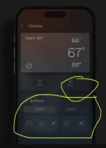
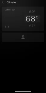
Got the 2.0 ios app today. I’m not seeing the “Surfaces” settings tile in my app. Missing the entire section. From release notes, it should look like the attached image but doesnt show up for me. Anyone else seeing this issue?
 

Attachments

  • IMG_5966.webp
    IMG_5966.webp
    42.4 KB · Views: 48
  • IMG_5967.webp
    IMG_5967.webp
    16.9 KB · Views: 50
Got the 2.0 ios app today. I’m not seeing the “Surfaces” settings tile in my app. Missing the entire section. From release notes, it should look like the attached image but doesnt show up for me. Anyone else seeing this issue?
This has been asked and answered several times. Please read back on this thread.
 
Back
Top