Better Use of Air Cockpit Real Estate

Joined
Mar 2, 2022
Messages
97
Location
Columbus, OH
Cars
Lucid Grand Touring 2022
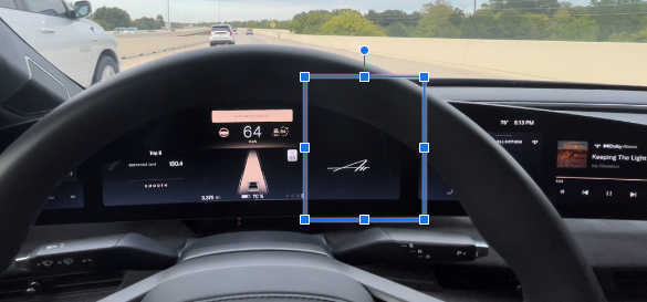
Apologies if this has already been discussed but it seems like the Lucid UI could take better use of this space on the cockpit (oh, like displaying music info while the pilot panel is showing Nav) than reminding me that I am driving an Air.
Screenshot_20221018_171450.png
 
Apologies if this has already been discussed but it seems like the Lucid UI could take better use of this space on the cockpit (oh, like displaying music info while the pilot panel is showing Nav) than reminding me that I am driving an Air.
View attachment 5713
It's coming in 2.0. Turn by Turn navigation shows up. I suspect in future more things will be added that section depending on what Apps you're running etc. but the Nav is a good starting point.

6BE2AA68-8284-4753-9304-7AA1FA710F4B.jpeg
 
It's coming in 2.0. Turn by Turn navigation shows up. I suspect in future more things will be added that section depending on what Apps you're running etc. but the Nav is a good starting point.

View attachment 5714
I am on 2.0.12 and on my screen the "Air" logo remains in place in the right most corner of the center display screen.
 
I am on 2.0.12 and on my screen the "Air" logo remains in place in the right most corner of the center display screen.
This seems like a known bug. There are other reports of it on here. Definitely let Customer Care know.
 
Apologies if this has already been discussed but it seems like the Lucid UI could take better use of this space on the cockpit (oh, like displaying music info while the pilot panel is showing Nav) than reminding me that I am driving an Air.
View attachment 5713
I agree. I made similar comments shortly after I took delivery a few months ago. Not sure who is monitoring this forum but I think it’s also pretty dangerous to be driving and needing to hit a few buttons on the dash to get to music. Also, why do we need so much real estate on the dash allocated to “home” and “work” locations? I know where I live and work and don’t need that to be showing 100% of the time.
 
I agree. I made similar comments shortly after I took delivery a few months ago. Not sure who is monitoring this forum but I think it’s also pretty dangerous to be driving and needing to hit a few buttons on the dash to get to music. Also, why do we need so much real estate on the dash allocated to “home” and “work” locations? I know where I live and work and don’t need that to be showing 100% of the time.
Totally agree. The three most common displays people use are Nav Climate and music. Right now we can’t have Nav on the lower screen while playing music on the upper. I can do without display of climate the on whole time driving due to the thoughtful inclusion of physical temp and fan speed buttons. It would however be nice to bifurcate the pilot panel horizontally to include Nav and climate now that Nav gives you point by point directions in the space where the air logo was in the center screen.
 
I agree. I made similar comments shortly after I took delivery a few months ago. Not sure who is monitoring this forum but I think it’s also pretty dangerous to be driving and needing to hit a few buttons on the dash to get to music. Also, why do we need so much real estate on the dash allocated to “home” and “work” locations? I know where I live and work and don’t need that to be showing 100% of the time.
yeah, 99% of the time I know the route Home and 100% I don't go to Work ;-)
 
Im 6'5" and thus have the drivers seat in its lowest and furtherst back position and seat back far back and steering wheel furthest out and almost at its lowest position. For me the steering wheel blocks ~70% of the blinkers mirrors rear view cameras and it blocks such that the steering wheel rim pretty much cuts through the center of each one of the camera views rendering them completely useless. I wish there were a few different selectable center cockpit views and one with cameras views moved a couple of inches towards the center of the cockpit.
 
I agree. I made similar comments shortly after I took delivery a few months ago. Not sure who is monitoring this forum but I think it’s also pretty dangerous to be driving and needing to hit a few buttons on the dash to get to music. Also, why do we need so much real estate on the dash allocated to “home” and “work” locations? I know where I live and work and don’t need that to be showing 100% of the time.
I tried to figure out how to get rid of the "work" menu item, I'm retired so isn't necessary to navigate to "work" - thankfully.
 
Im 6'5" and thus have the drivers seat in its lowest and furtherst back position and seat back far back and steering wheel furthest out and almost at its lowest position. For me the steering wheel blocks ~70% of the blinkers mirrors rear view cameras and it blocks such that the steering wheel rim pretty much cuts through the center of each one of the camera views rendering them completely useless. I wish there were a few different selectable center cockpit views and one with cameras views moved a couple of inches towards the center of the cockpit.
Agree! It would be great to have a centered blind spot camera view as an option.
 
... but I think it’s also pretty dangerous to be driving and needing to hit a few buttons on the dash to get to music
I agree with this, but after a while I realized that it's much better and safer to use Alexa in any case when I want to play/change music. Now I just hit the "Alexa button" on the steering wheel and say "turn on the radio" or whatever - super simple and my eyes never leave the road.

In general, if you're not used to using Alexa in a car (I wasn't), I highly recommend trying to get used to it for various car functions (turning on the radio, changing the temp, etc.) I think you'll find yourself using buttons/touch panel way less.
 
I tried to figure out how to get rid of the "work" menu item, I'm retired so isn't necessary to navigate to "work" - thankfully.
I agree. I wish there was a way to make the “Work” Nav setting optional. It takes up unnecessary real estate for us retired folks.
 
A nice implementation might be to put the top two destinations in the menu, if any have been defined. Most of us know the way to work or home and don't need it for day-to-day use. "Home" can be convenient when you are in some less usual location and want to find the best route home taking traffic, construction, ... into consideration, so I can see leaving it there like most GPS implementations provide "Home" as a single-touch destination.
 
I would be nice to at least have “work” as optional .
 
I agree with this, but after a while I realized that it's much better and safer to use Alexa in any case when I want to play/change music. Now I just hit the "Alexa button" on the steering wheel and say "turn on the radio" or whatever - super simple and my eyes never leave the road.

In general, if you're not used to using Alexa in a car (I wasn't), I highly recommend trying to get used to it for various car functions (turning on the radio, changing the temp, etc.) I think you'll find yourself using buttons/touch panel way less.
"Alexa" will be good once she works reliably. "Mercedes Me" in the EQS works very well. Oddly, I find talking to my car more distracting than reaching for a physical button.
 
I agree, and a simple way to do that is to not show it until you've saved a "Work" location.
There are a dozen or more of these issues in the Lucid UI. Once the software is stable and for the most part feature complete, I would like to see Lucid allow the user the ability to customize the UI ala an iPhone or Android device. Merecedes, GM and Ford have this to varying degrees.
 
Back
Top