Took delivery on Air touring, which I plan to write a full review on delivery experience and car (love it!). So the DA and assistant (two people one on each side) ended up putting in Cali Bear on the sides. And I noticed One side is one inch above the other sticker. Maybe I am OCD ? Idk but I ask the DA for extra sticker so I place it on same alignment as other side. Anyone else be bothered by this??
-
Lucid Gravity Reservation Tracker: Add Your Gravity Reservation
You are using an out of date browser. It may not display this or other websites correctly.
You should upgrade or use an alternative browser.
You should upgrade or use an alternative browser.
Would the Cali bear placement bother you?
- Thread starter uscnamja781
- Start date
-
- Tags
- cali bear
- Status
- Not open for further replies.
- Joined
- Dec 17, 2021
- Messages
- 1,295
- Reaction score
- 1,996
- Location
- Greenville, SC
- Cars
- Sapphire 1 of 6
Love it.I know you are an apple fan, so you should know the story behind this..
View attachment 15917
Ford has trademark for Mustang.
Lucid describes the bear this way.
“The headrest showcases a debossed Lucid bear logomark, one of the icons of the Lucid brand identity reflecting the California origins of the brand. ”
- Joined
- Aug 12, 2022
- Messages
- 1,432
- Reaction score
- 1,293
- Location
- Buffalo, NY
- Cars
- Lucid Air Touring
- Referral Code
- BJ2URGEK
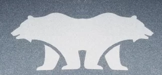
OK, all of you logo purists, if that bear can only face left or west, why do the bears on the sides of the front seats all face up? Shouldn't one face the opposite direction? Lolol
- Joined
- Nov 28, 2022
- Messages
- 5,910
- Reaction score
- 3,263
- Location
- Edison, NJ
- Cars
- Kia EV9, future Air?
Relativity!OK, all of you logo purists, if that bear can only face left or west, why do the bears on the sides of the front seats all face up? Shouldn't one face the opposite direction? Lolol
- Joined
- Dec 2, 2021
- Messages
- 508
- Reaction score
- 558
- Cars
- 2023 Lucid Air GT
I like my bear decals and they are uniformly placed. It is a pity that Lucid did not make them in sets with a left and right front-facing bear. To me, it is a very distinctive addition and statement.
- Joined
- May 4, 2022
- Messages
- 59
- Reaction score
- 112
- Cars
- Lucid GT
I would have them fix it!View attachment 11275View attachment 11276
Took delivery on Air touring, which I plan to write a full review on delivery experience and car (love it!). So the DA and assistant (two people one on each side) ended up putting in Cali Bear on the sides. And I noticed One side is one inch above the other sticker. Maybe I am OCD ? Idk but I ask the DA for extra sticker so I place it on same alignment as other side. Anyone else be bothered by this??
^^ Actually nevermind, upon closer inspection it looks like a uterus monster.
- Joined
- May 1, 2022
- Messages
- 6,108
- Reaction score
- 9,342
- Location
- San Francisco, CA
- Cars
- Air Touring
- Referral Code
- MX1KDTYY
I actually think Steve was right about that. The logo should face up when you are looking at it closed.I know you are an apple fan, so you should know the story behind this..
View attachment 15917
But again, the point is that logo placement matters. On a laptop, it’s going to be upside down sometimes no matter what. So you pick one and move on. You don’t flip the logo horizontally.
- Joined
- Dec 17, 2021
- Messages
- 1,295
- Reaction score
- 1,996
- Location
- Greenville, SC
- Cars
- Sapphire 1 of 6
Steve made both decisions and there are far more MacBooks with logo right side up when open.I actually think Steve was right about that. The logo should face up when you are looking at it closed.
But again, the point is that logo placement matters. On a laptop, it’s going to be upside down sometimes no matter what. So you pick one and move on. You don’t flip the logo horizontally.
Ford Mustang is a compare for auto industry. There are plenty of others.
We are clearly in an area of opinion not fact.
My opinion is the Apple logo is correct right side up when open and Ford and Eagles got it right with an Animal logo always pointing forward.
- Joined
- May 1, 2022
- Messages
- 6,108
- Reaction score
- 9,342
- Location
- San Francisco, CA
- Cars
- Air Touring
- Referral Code
- MX1KDTYY
You'll note in the case of the mustang that they didn't simply "flip the horse" on the front of the car for the sides. They created an entirely new mark, with the word, the vertical bars, etc. and then created a left and right version.I would not consider the Bear a logo for Lucid or Mustang a Ford logo.
I think Ford got it right.
View attachment 15913View attachment 15914
Lucid could have gone in that direction with a separate mark. But the stickers were more of a late edition, as the car had already shipped.
If you asked anyone to draw the "Mustang Logo" from memory, the one thing they'd all get right is that the horse is in a box, and it faces left. Almost no one would draw the version with the vertical bars that are featured on the side of this model.
I will not be surprised if some future model from Lucid just has the bear as a badge on the front hood and back. When the Air was designed, they only had the word mark, so they went with that. (The bear would probably look wrong as a badge on the Air in its current form, anyway.
- Joined
- Nov 28, 2022
- Messages
- 5,910
- Reaction score
- 3,263
- Location
- Edison, NJ
- Cars
- Kia EV9, future Air?
I mean, I have a new macbook air and for some reason I always find myself flipping up the wrong side of the laptop(it doesnt lift, obviously). I have never had this problem with any other laptop, maybe just the macbooks wedge shape and the prominent logo?(my galaxy book has a subtle samsung logo compared to the apple one)Steve made both decisions and there are far more MacBooks with logo right side up when open.
Ford Mustang is a compare for auto industry. There are plenty of others.
We are clearly in an area of opinion not fact.
My opinion is the Apple logo is correct right side up when open and Ford and Eagles got it right with an Animal logo always pointing forward.
View attachment 15921
- Joined
- Nov 28, 2022
- Messages
- 5,910
- Reaction score
- 3,263
- Location
- Edison, NJ
- Cars
- Kia EV9, future Air?
I think bear etched on front, rear stays lucid is the way to go! But at this point, we need more brand recognition, not less.(or should I say less confusion?)You'll note in the case of the mustang that they didn't simply "flip the horse" on the front of the car for the sides. They created an entirely new mark, with the word, the vertical bars, etc. and then created a left and right version.
Lucid could have gone in that direction with a separate mark. But the stickers were more of a late edition, as the car had already shipped.
If you asked anyone to draw the "Mustang Logo" from memory, the one thing they'd all get right is that the horse is in a box, and it faces left. Almost no one would draw the version with the vertical bars that are featured on the side of this model.
I will not be surprised if some future model from Lucid just has the bear as a badge on the front hood and back. When the Air was designed, they only had the word mark, so they went with that. (The bear would probably look wrong as a badge on the Air in its current form, anyway.
- Joined
- May 1, 2022
- Messages
- 6,108
- Reaction score
- 9,342
- Location
- San Francisco, CA
- Cars
- Air Touring
- Referral Code
- MX1KDTYY
I don't know what that monstrosity is, but it's not an Eagles helmet. The Eagles helmet has wings on either side.Steve made both decisions and there are far more MacBooks with logo right side up when open.
Ford Mustang is a compare for auto industry. There are plenty of others.
We are clearly in an area of opinion not fact.
My opinion is the Apple logo is correct right side up when open and Ford and Eagles got it right with an Animal logo always pointing forward.
View attachment 15921
- Joined
- Dec 17, 2021
- Messages
- 1,295
- Reaction score
- 1,996
- Location
- Greenville, SC
- Cars
- Sapphire 1 of 6
As a Cowboy fan I couldn’t resist. Real examples would be Buffalo Bills, Seahawks, or Patriots.I don't know what that monstrosity is, but it's not an Eagles helmet. The Eagles helmet has wings on either side.
- Joined
- May 1, 2022
- Messages
- 6,108
- Reaction score
- 9,342
- Location
- San Francisco, CA
- Cars
- Air Touring
- Referral Code
- MX1KDTYY
Well, sure. Now. Because they made the call and stuck with it. And they sell way more MacBooks now than they did in the early 2000s.Steve made both decisions and there are far more MacBooks with logo right side up when open.
Either way, it's literally impossible to not have the logo be upside down sometimes. So they went with the version where the logo was right side up to the outsider while using it. I thought the version where it confused the actual owner of the laptop less was the better call, but I'm sure the marketing department prefers the current orientation, too.
This isn't the case on the side of a car. The logo doesn't move, so there's no fear it'll be upside down or backwards sometimes.
Agreed we are in the realm of opinion here. But the old graphic designer in me leans toward the pure interpretation of branding.
I still think if they want to do the whole "animal faces forward" thing, they would need to design an alternate mark that is designed to be flipped that way. The current bear, as it stands, is becoming a primary branding element for Lucid, and thus should remain intact.
Like I said at the beginning of this rant, I don't like the bear on the sides at all. I find it kills the clean lines of the car, and it clearly wasn't the original intention of the design team. It will forever look like what it is—a sticker on the side of your $100k+ luxury sedan.
- Joined
- May 1, 2022
- Messages
- 6,108
- Reaction score
- 9,342
- Location
- San Francisco, CA
- Cars
- Air Touring
- Referral Code
- MX1KDTYY
Well, the Cowboys were smart and designed a logo that's symmetrical. So they never have to worry about this problem. See also: Adidas.As a Cowboy fan I couldn’t resist. Real examples would be Buffalo Bills, Seahawks, or Patriots.
- Joined
- Apr 17, 2022
- Messages
- 1,369
- Reaction score
- 1,620
- Location
- Chula Vista CA
- Cars
- Tesla MX, Air GT
It will forever look like what it is—a sticker on the side of your $100k+ luxury sedan.
My friends who know me well were shocked when I put the bear stickers on my car. Me, the never-stickers, never-eat-in-my-car, never-chrome-delete, type of guy.
- Joined
- Aug 23, 2020
- Messages
- 3,876
- Reaction score
- 4,765
- Location
- Paradise Valley, AZ
- Cars
- Lucid GT
- Referral Code
- K9WIJHB0
I am really curious if Jenny Ha has one of the "ugly" bear stickers on her car.I don't like the bear on the sides at all. I find it kills the clean lines of the car, and it clearly wasn't the original intention of the design team.
- Joined
- Dec 17, 2021
- Messages
- 1,295
- Reaction score
- 1,996
- Location
- Greenville, SC
- Cars
- Sapphire 1 of 6
I’m not a big fan of the Bear stickers either. Ferrari or Porsche the crest the horse is always the same. Plenty of examples both ways.Well, sure. Now. Because they made the call and stuck with it. And they sell way more MacBooks now than they did in the early 2000s.
Either way, it's literally impossible to not have the logo be upside down sometimes. So they went with the version where the logo was right side up to the outsider while using it. I thought the version where it confused the actual owner of the laptop less was the better call, but I'm sure the marketing department prefers the current orientation, too.
This isn't the case on the side of a car. The logo doesn't move, so there's no fear it'll be upside down or backwards sometimes.
Agreed we are in the realm of opinion here. But the old graphic designer in me leans toward the pure interpretation of branding.
I still think if they want to do the whole "animal faces forward" thing, they would need to design an alternate mark that is designed to be flipped that way. The current bear, as it stands, is becoming a primary branding element for Lucid, and thus should remain intact.
Like I said at the beginning of this rant, I don't like the bear on the sides at all. I find it kills the clean lines of the car, and it clearly wasn't the original intention of the design team. It will forever look like what it is—a sticker on the side of your $100k+ luxury sedan.
And here we go again.I told informed that the bear was taken from the bear on the California's state flag. It always looks to the left.
Politics being thrown into a very balanced (till now) forum.
Yours (and others) political affiliation shown, who gives a shit about, try to keep it to yourself.
Again and again, half of the country has a different view.
In HA mode, does the Lucid do it on purpose to bounce between the lines from the left to the right and from the right to the left?
If so, that would be a great inside joke.
- Status
- Not open for further replies.
Similar threads
- Replies
- 3
- Views
- 1K
- Replies
- 27
- Views
- 4K