Some questions about Native Nav

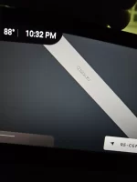
Yes actually... As you can see, both of these are the same picture, the second is at "max" zoom... But the size is the text never changes in size.

Is this different for any of you? The text and the clock font provide reference...
I'm sure a future update will address this, but just curious.
 

Attachments

  • 20230511_223158.webp
    20230511_223158.webp
    716.6 KB · Views: 142
  • 20230511_223242.webp
    20230511_223242.webp
    895.9 KB · Views: 153
  • 20230511_223158.webp
    20230511_223158.webp
    716.6 KB · Views: 155
  • 20230511_223242.webp
    20230511_223242.webp
    895.9 KB · Views: 141
Re-visiting this thread.

I just returned to LA after a 10 day visit in the Bay Area. I really wanted to use that big Pilot Panel for navigating, but the impossibly small font makes the experience extremely frustrating. I am guessing that the software was configured for a lower resolution screen (larger size pixels) and then never updated when the resolution was finalized. Or it's just really bad design.

The problems:
  1. Street labels are rediculously small. Probably 5pt text. And a thin-lined font, not something designed to be readable on a map.
  2. The color choices for the background, lines and annotation are really, really poor. They appear to have been chosen by a "designer" who wanted "an elegant look", not an actual UI designer. The contrast is terrible - the lines are light grey and the background is dark grey. Compare the colors on the Lucid map with any of the phone apps, and you will immediately notice that the phone apps use high contrast colors.
  3. The line widths are ridiculously small, creating a map with laughably large open spaces between tiny lines.
  4. The Point of Interest iconography and text chooses silly colors, again with terribly small fonts and poor color contrast. OK, maybe it is nice to have different colors for different types of icons, but choosing the poor-contrast icon color to also serve as the text color just causes the text to be unreadable. And of course the text size is laughably small.
  5. The fonts and line widths stay the same at all scales. I will grant that map annotation is a difficult problem (I worked on just this problem 25 years ago, and there are a great many tricky bits to solve. For example, at a given scale the information density in an urban area is very different than the density in a suburban or rural area.) But making fonts, line widths and icons larger at smaller scales is really easy to implement and would go a long way to providing a better UI.
  6. There are no tunables for the user. How about providing two or three options for map text size? That way, the user can make their own trade off larger text for the clutter and overlapping annotation.
  7. I can't set the maps to enforce North Up. There used to be a North Up option, but it was conflated with the 2D/3D option rather than being orthogonal to that option.
  8. When I turn on CarPlay, the Nav Map is lost on the Pilot Panel. Why? When I turn on Nav, I want Nav to stay on.
  9. Yes, we can use Maps in CarPlay and the many mapping applications available on my phone do not have these problems. But that screen is tiny and there is a very large screen nearby.
These are not particularly difficult problems to solve. I would suggest that the biggest problems are self-inflicted, by trying to apply some sort of "elegant" design aesthetic to what is fundamentally a utilitarian application.
 
All valid points! There are some pros, for example I find my navigation and directions to be fine... But agree and hope someone at Lucid is reading this. It would be a great near future update 😃

If they ever engage split screen activity options like you're suggesting, it'll be amazing. I'm sure they're aware...
Maybe it'll come right after android auto, hehe.
Despite the smaller screen, CarPlay mapping is much better at this point.
 
Yes, I should have been more complimentary about the good parts.

The Nav seems responsive to traffic. Do we know if that is true, or am I just imagining it?

Also, the address and POI search seems to work just fine and is reasonably responsive.

Seems to me that the advantage Lucid maps and nav brings over CarPlay apps is that huge screen, so they should really leverage that and fix the readability problems. Otherwise, it will always be a poor step child.
 
On longer road trips, the native nav still occasionally plots a random suboptimal non-EA charger even if there’s a perfectly good EA station a block away 🤷🏼‍♂️
 
Yes actually... As you can see, both of these are the same picture, the second is at "max" zoom... But the size is the text never changes in size.

Is this different for any of you? The text and the clock font provide reference...
I'm sure a future update will address this, but just curious.
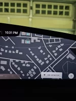
yes, the map is so hard to use, I hope they can update the software so that we can see the name of the roads.
 
Back
Top