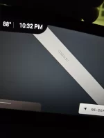
Yes actually... As you can see, both of these are the same picture, the second is at "max" zoom... But the size is the text never changes in size.
Is this different for any of you? The text and the clock font provide reference...
I'm sure a future update will address this, but just curious.
Is this different for any of you? The text and the clock font provide reference...
I'm sure a future update will address this, but just curious.