I recently picked up a 2025 AT. Love the car- its a beauty and an absolute beast.
I’m not a fan of the Carplay approach, so I’m trying to use the native Lucid software.
Coming from Tesla model S, I’m a little disappointed so far. But I completely understand that patience is required. Tesla has a long head start, and software is hard.
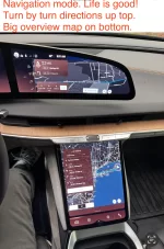
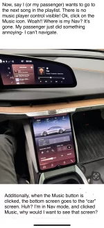
My biggest complaint so far is the “tab” scheme in the UI, and that you can only see one “tab” at a time. The tabs are: Home, Navigation, Music and Phone.
On the Tesla, there were no tabs. Everything is available on the main screen. Navigation defaulting to a majority of the screen, music at the bottom, and phone a simple overlay.
So if you’re driving somewhere via Navigation, you can still control music, get phone calls etc and still see the Navigation UI.
I’m befuddled by the fact that this isnt possible on the Lucid, considering all the screen real estate. My feeling is that the top right screen should always stay in Nav mode, and that Nav and Music can share the bottom screen. The music controls should always be visible (at the bottom), and could be expandable by dragging up.
Under no circumstances do I want my turn-by-turn Nav screen to disappear. I’d almost consider that a safety issue. If my kid or wife want to mess around with the Music, they can do that on the screen below (without having to first reach over and click a tiny Music” icon thats closer to me than them!)
I feel strongly that this tabbed approach is terrible. With all that screen real estate, just display all the controls for Nav and Music across both screens- no tabs.
I’m not a fan of the Carplay approach, so I’m trying to use the native Lucid software.
Coming from Tesla model S, I’m a little disappointed so far. But I completely understand that patience is required. Tesla has a long head start, and software is hard.
My biggest complaint so far is the “tab” scheme in the UI, and that you can only see one “tab” at a time. The tabs are: Home, Navigation, Music and Phone.
On the Tesla, there were no tabs. Everything is available on the main screen. Navigation defaulting to a majority of the screen, music at the bottom, and phone a simple overlay.
So if you’re driving somewhere via Navigation, you can still control music, get phone calls etc and still see the Navigation UI.
I’m befuddled by the fact that this isnt possible on the Lucid, considering all the screen real estate. My feeling is that the top right screen should always stay in Nav mode, and that Nav and Music can share the bottom screen. The music controls should always be visible (at the bottom), and could be expandable by dragging up.
Under no circumstances do I want my turn-by-turn Nav screen to disappear. I’d almost consider that a safety issue. If my kid or wife want to mess around with the Music, they can do that on the screen below (without having to first reach over and click a tiny Music” icon thats closer to me than them!)
I feel strongly that this tabbed approach is terrible. With all that screen real estate, just display all the controls for Nav and Music across both screens- no tabs.