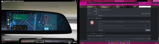
UX 3.0 Update

The one thing you can't do is to operate both Google Maps and the native Nav at the same time.
This is because both use the car’s onboard GPS, and there is only one.
 
Isn't carplay supposed to fill the whole right side panel?
No. They got rid of the left side icons, thus filling the space.

It is an Apple requirement that the aspect ratio cannot change. Thus, the rounded rectangle which doesn’t take advantage of the full screen.
 
I read about the carplay rectangle and top panel requirements, but thought some concession was made as the imagery appears that the full screen would be used, the wording in the release notes also lends one to expect it to look like the lucid/google nav experience. Oh well, the sound improvements in carplay alone made this update worth it to me.
 
They removed the Lucid Home/Nav/Media/Phone buttons on the left of the screen, so CarPlay and AA now fill all the way to the left. That's the change. CP can't display on a non-rectangular screen. An update to AA is pending with Google to allow maps to go all the way to fill a non-rectangular screen.
Here's what it'll look like as soon as the AA update is released. The rendering from Google looks great in the Lucid Gravity and soon Air.
 

Attachments

  • Screenshot (3).webp
    Screenshot (3).webp
    205.9 KB · Views: 147
This is because both use the car’s onboard GPS, and there is only one.
This may be nit-picky or there's something I don't understand, but today I used Waze and Lucid Nav together. Was great to have Waze alerts and Lucid doing the nav on the Pilot panel. If you are saying you can't Navigate on both simultaneously, that absolutely appears to be the case. But both appear to be able to utilize the GPS simultaneously, just routing on one or the other.
 
Please tell me they fixed the iPhone key and allowed us to turn off auto lock at home and work... pretty please?
 
I read about the carplay rectangle and top panel requirements, but thought some concession was made as the imagery appears that the full screen would be used, the wording in the release notes also lends one to expect it to look like the lucid/google nav experience. Oh well, the sound improvements in carplay alone made this update worth it to me.
The sound improvement had been mentioned a few times but I don’t think the release notes posted here mentioned it. I’d love to know what those improvements are!
 
No. They got rid of the left side icons, thus filling the space.

It is an Apple requirement that the aspect ratio cannot change. Thus, the rounded rectangle which doesn’t take advantage of the full screen.
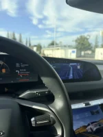
fwiw, I think the wider CarPlay is worse, because the steering wheel now hides important info. Bigger isn’t always better.

This is the only disappointing thing in this update, personally, because it means a designer wasn’t asked about this; when the car first shipped, it had those icons on the right (too hard to reach), then the far left (too hard to see with the wheel), and then the left padding fixed it.

Now, when CarPlay is on, this is a regression imho.

But hey, it sure is wider!

IMG_0094.webp
 
fwiw, I think the wider CarPlay is worse, because the steering wheel now hides important info. Bigger isn’t always better.

This is the only disappointing thing in this update, personally, because it means a designer wasn’t asked about this; when the car first shipped, it had those icons on the right (too hard to reach), then the far left (too hard to see with the wheel), and then the left padding fixed it.

Now, when CarPlay is on, this is a regression imho.

But hey, it sure is wider!

It doesn't bother me at all with AA. I much prefer it. I don't switch between apps all that often, plus it's not a huge hassle to lean over a couple inches when I do need to see them. I prefer the additional real estate for actual content.

Though I would fully support an option to toggle between the options for those who don't want it.
 
fwiw, I think the wider CarPlay is worse, because the steering wheel now hides important info. Bigger isn’t always better.

This is the only disappointing thing in this update, personally, because it means a designer wasn’t asked about this; when the car first shipped, it had those icons on the right (too hard to reach), then the far left (too hard to see with the wheel), and then the left padding fixed it.

Now, when CarPlay is on, this is a regression imho.

But hey, it sure is wider!

View attachment 41554

IMG_8810.webp
Missing important info 😜
 
This is because both use the car’s onboard GPS, and there is only one.
You're usually the voice of reason here, but that just makes no sense. My iPhone only has one GPS, but I can have a dozen apps on it all using that GPS at the same time. It's just a data source, not an exclusive feed that can't be read by multiple apps.

I have long been frustrated that the Air does not allow two nav apps to be routing at the same time. My use case for that is to mostly use the built-in Lucid nav, which has a nicer user interface, but also have Waze open through CarPlay so that I can compare the proposed routes when we reach decision points based on current traffic.
 
If I'm not mistaken CarPlay uses the GPS in the phone.. there should be no issue using the Lucid GPS on the Pilot Panel and the AA or CP nav in the top panel at the same time. Will have to try it today. By the way.. a small positive discovery.. my AGT now reports the correct outside temperature.. often it was 8-10 degree off.
 
Back
Top