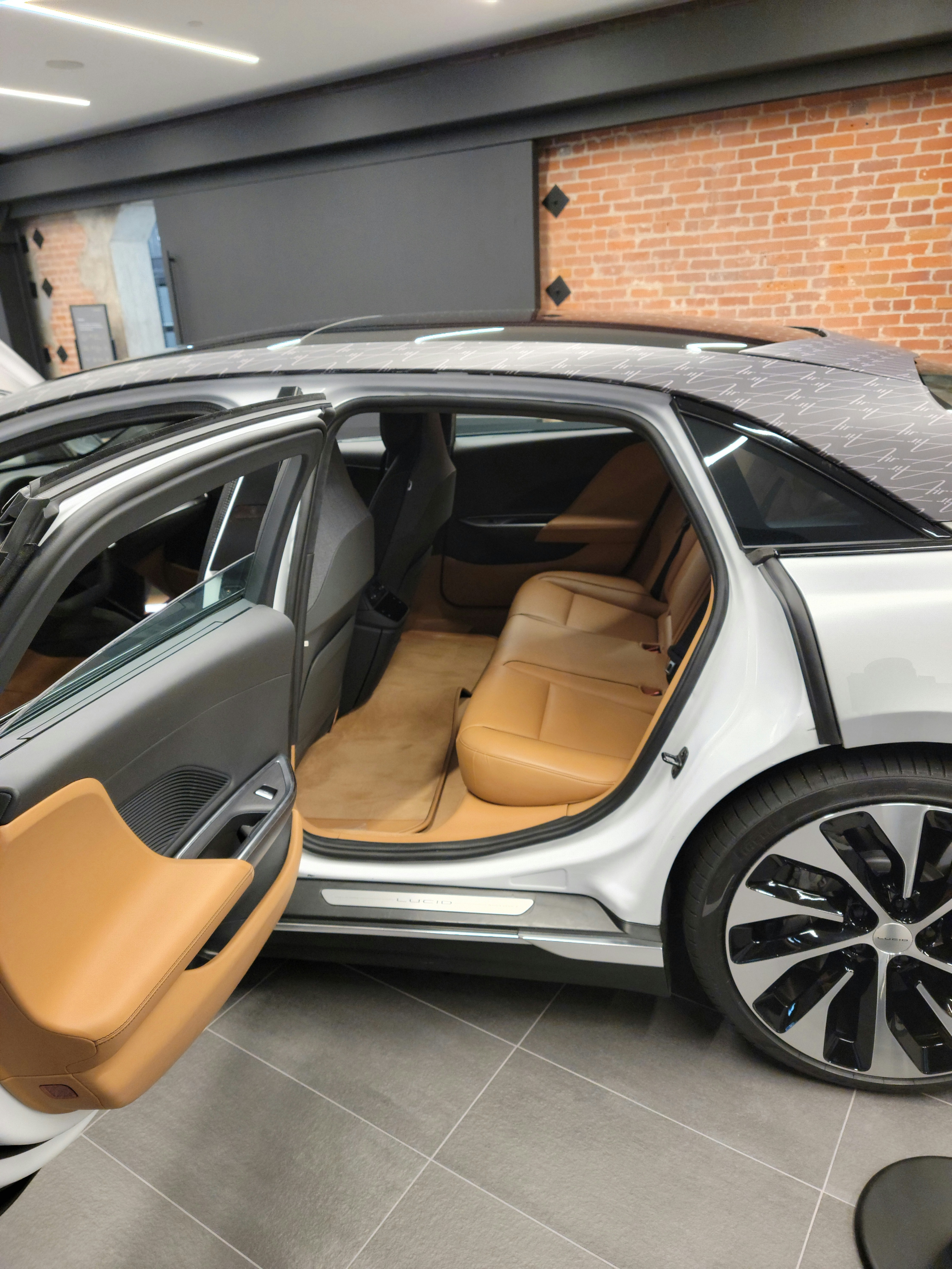
Does anyone have pics of the Santa Cruz interior? I asked my DA about it, and he’s only seen Santa Monicas. I’m trying to get an idea of how light the backseats are. I was originally going to go for Tahoe, but it looks a little too oompah-loompah-ish for comfort.
You are using an out of date browser. It may not display this or other websites correctly.
You should upgrade or use an alternative browser.
You should upgrade or use an alternative browser.
Santa Cruz interior pics?
- Thread starter Dortreo
- Start date
- Joined
- Sep 22, 2021
- Messages
- 197
- Cars
- Air GT (Red, SC, w 21)
This is a picture from the web site for Santa Cruz. I ended up choosing Santa Cruz.Does anyone have pics of the Santa Cruz interior? I asked my DA about it, and he’s only seen Santa Monicas. I’m trying to get an idea of how light the backseats are. I was originally going to go for Tahoe, but it looks a little too oompah-loompah-ish for comfort.
- Joined
- Sep 22, 2021
- Messages
- 197
- Cars
- Air GT (Red, SC, w 21)
One more showing the front seats with the light contrast and wood color.
Thanks! I meant real life pics. I don’t quite trust the computer mock-ups.
I was going to go with the Tahoe interior based on the Lucid website mock-ups, but the real-life pics showed the interior to be more orange than I liked.
I was going to go with the Tahoe interior based on the Lucid website mock-ups, but the real-life pics showed the interior to be more orange than I liked.
The Tahoe interior is ‘orangy’ to me as well. I have only seen it and the Mojave. I have seen the Santa Cruz materials in the studios, just not on a car yet, and that is what we selected. (We actually liked the Santa Monica the best but that is only on the Dreams).
- Joined
- Mar 7, 2020
- Messages
- 4,228
- Location
- Naples, FL
- Cars
- Model S Plaid, Odyssey
- DE Number
- 154
- Referral Code
- 033M4EXG
If you check some of the earlier Air videos on YouTube, the Santa Cruz was the interior usually shown. Both Peter Rawlinson and Alex Guberman of "E for Electric" said it was their favorite -- although the Santa Monica had not yet come along.
- Joined
- Dec 18, 2021
- Messages
- 190
- Cars
- DB9 Lucid GT
On December 11 my wife and I went to the pre-opening of the Milbrae facility. They had cars in Gold, Red, Black and a White. Interiors in the cars where Santa Cruz, Tahoe and Mojave.
In my opinion the Tahoe was too orange. The Mojave my wife liked but I felt the wood was nicer on the Santa Cruz. At the end of the day we decided on the Santa Cruz Wrapped in Silver
In my opinion the Tahoe was too orange. The Mojave my wife liked but I felt the wood was nicer on the Santa Cruz. At the end of the day we decided on the Santa Cruz Wrapped in Silver
- Joined
- Dec 18, 2021
- Messages
- 190
- Cars
- DB9 Lucid GT
The back seats are light but not white. I would describe them as a pleasant beige white. Have two cars with light interiors one is white, which is much lighter than Santa Cruz, the other is a 2021 MBZ E350 with the macchiato interior which is closer to Santa Cruz. Hope this helps.Does anyone have pics of the Santa Cruz interior? I asked my DA about it, and he’s only seen Santa Monicas. I’m trying to get an idea of how light the backseats are. I was originally going to go for Tahoe, but it looks a little too oompah-loompah-ish for comfort.
- Joined
- Nov 18, 2021
- Messages
- 232
- Location
- New Smyrna Beach, FL
- Cars
- Lucid AGT, Z06 Corvette
- Referral Code
- ERLT5FS6
I'll take the contrary position. My original thought was to select the Santa Cruz for my Air GT, as I like light interiors. However, after seeing the Tahoe in the Miami Studio, I preferred that one. To me, the Santa Cruz has too many colors going on: the walnut wood, the dark and light gray, the beigish white, orangish stitching on the seats, and too much of a contrast between the front and back seat face colors. The car in the Miami Studio is Quantum Grey with the Tahoe interior, and that's the color combo I went with. If the Santa Monica interior was available on the GT, I might have gone with that because I like the grey wood. I'm not big on the walnut in the Santa Cruz because I somehow survived the 1970s, and I don't want to be reminded of it!
To me the Tahoe color on the actual car looks rich, and not orangish, plus I think it's a simpler and more minimalist color scheme. But, to each his own. None of the color selections are bad.
I was just down at the Miami Studio for Christmas and met a new (to me) advisor. Without me saying anything, he said that he thought the Santa Cruz interior had too many different colors in it.
- Joined
- Aug 23, 2020
- Messages
- 2,951
- Location
- Paradise Valley, AZ
- Cars
- Lucid GT
- Referral Code
- K9WIJHB0
I agree. I have seen the Tahoe in person in Scottsdale and really liked it. I have also seen pictures online where it looked orange and where it did not. It seems to be a color that you need to look at in person and decide for yourself.To me the Tahoe color on the actual car looks rich, and not orangish, plus I think it's a simpler and more minimalist color scheme.
- Joined
- Sep 10, 2021
- Messages
- 1,727
- Location
- California Central Coast
- Cars
- Matte Grey Air GT
- DE Number
- 0
- Referral Code
- I79OY1W7
This is from Beverly Hills a few months ago. I'd describe the tone as a caramel brown.

I'm not big on the walnut in the Santa Cruz because I somehow survived the 1970s, and I don't want to be reminded of it!
This is my biggest concern with the Santa Cruz. I remember when my dad got his first Lexus it had that color wood in the interior so I always equate with "old people". Granted, I'm old too now but don't want to be stereotypically old.
Reminds me of that commercial about becoming our parents.
I agree...nothing looked better to me with a dark exterior than the Tahoe. Everything else felt a little busy or dark. Of course, haven't seen the two put together in an actual photo, so knows, but I'm thinking it's going to look great. But I'm also partially red-green color blind, so what do I know getting a ZR exterior with the Tahoe insideI agree. I have seen the Tahoe in person in Scottsdale and really liked it. I have also seen pictures online where it looked orange and where it did not. It seems to be a color that you need to look at in person and decide for yourself.
stealthpilot
Member
- Joined
- Dec 30, 2021
- Messages
- 86
- Cars
- Air Grand Touring
I was just down at the Miami Studio for Christmas and met a new (to me) advisor. Without me saying anything, he said that he thought the Santa Cruz interior had too many different colors in it.
The same guy told me the same thing last week. However I am not sure he is right.
Great interior designers follow a 60-30-10 rule. 60% is the primary color. 30% is the secondary color. 10% is the accent color. The Santa Cruz with the Black, beige and walnut is the only Lucid interior which follows this color scheme, the others are two-tone. Interiors with a 60-30-10 color scheme tend to look richer. Compare the rear doors of the Tahoe interior to the Santa Cruz interior in the images above. You will see what I mean. The addition of a third accent color makes the door look richer.

The 60-30-10 rule – how to use it to create a balanced color palette
The 60-30-10 rule is a classic interior design trick to ensure perfect color scheming every time
 www.homesandgardens.com
- Joined
- Nov 18, 2021
- Messages
- 232
- Location
- New Smyrna Beach, FL
- Cars
- Lucid AGT, Z06 Corvette
- Referral Code
- ERLT5FS6
Well, this is why it's nice that Lucid offers several interior color schemes. People can pick what they like!
- Joined
- Dec 18, 2021
- Messages
- 190
- Cars
- DB9 Lucid GT
Besides, the silvered Eucalyptus clashed with my powder blue leisure suit.Well, this is why it's nice that Lucid offers several interior color schemes. People can pick what they like!
Mistadobalina
New Member
We are between the Santa Cruz and Tahoe. I’d really like to see the Santa Cruz in-person on a cr.
- Joined
- Dec 23, 2021
- Messages
- 933
- Cars
- 2018 velar 2002 bmw z8
I have never heard color selection percentages quantified like that but it makes sense. I chose the Santa Cruz because I liked the walnut highlights with the brown stitching as well. My 74 BMW CSI was similar having a black / brown interior with walnut and polished aluminum highlights. It just personified quality and the Lucid hits all the same notes.The same guy told me the same thing last week. However I am not sure he is right.
Great interior designers follow a 60-30-10 rule. 60% is the primary color. 30% is the secondary color. 10% is the accent color. The Santa Cruz with the Black, beige and walnut is the only Lucid interior which follows this color scheme, the others are two-tone. Interiors with a 60-30-10 color scheme tend to look richer. Compare the rear doors of the Tahoe interior to the Santa Cruz interior in the images above. You will see what I mean. The addition of a third accent color makes the door look richer.

The 60-30-10 rule – how to use it to create a balanced color palette
The 60-30-10 rule is a classic interior design trick to ensure perfect color scheming every timewww.homesandgardens.com
- Joined
- Dec 7, 2021
- Messages
- 1,542
- Cars
- Dream Edition P 21"
- DE Number
- 337
They have a white GT at the Millbrae center with the Tahoe interior. It is gorgeous!! Before I got upgraded to the Dream I was going with the grey with Tahoe interior.We are between the Santa Cruz and Tahoe. I’d really like to see the Santa Cruz in-person on a cr.
Similar threads
- Replies
- 0
- Views
- 7K
- Replies
- 18
- Views
- 4K
- Replies
- 97
- Views
- 8K
